Mappr
Descubre las joyas ocultas del mundo
The Barcelona-based travel tech startup Mappr enables individuals to discover the hidden gems at their current destination, provided by content creators. These content creators can generate an income by sharing their favorite food or travel spots, making Mappr a platform every user benefits from.
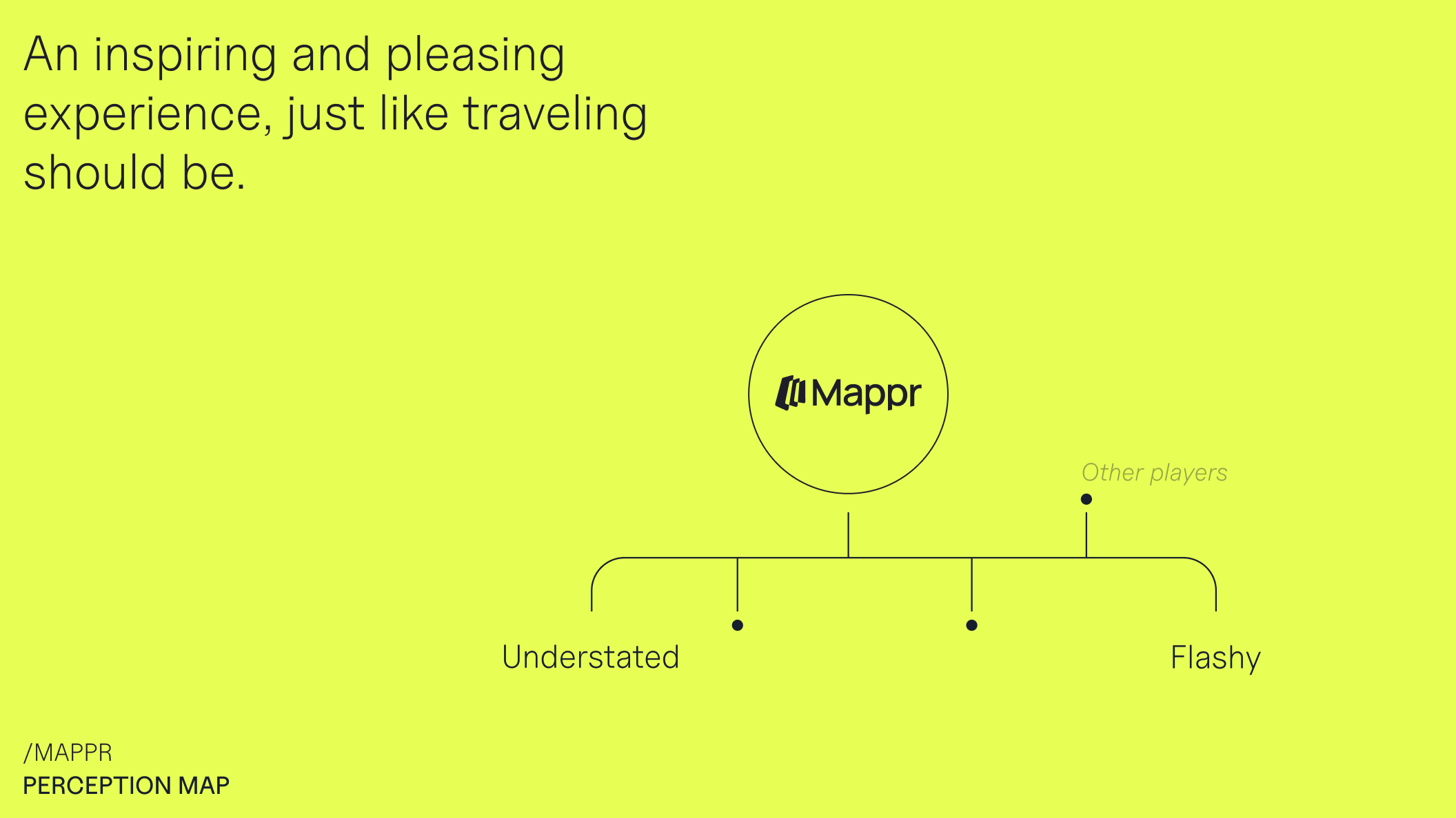
On holiday, finding great places to visit can be challenging. Mappr's personalized location recommendations, however, can make your stay unforgettable. An unforgettable brand experience was also the goal of this branding project. With the highly competitive travel tech market in mind, we set off to create a brand that stands out and appeals not only to content creators, influencers, and companies but also to travelers seeking unique experiences.
Mappr's mission to collectively discover the world by empowering content creators to monetize their content is encapsulated in their brand concept "Unfolding the Map". This concept aligns perfectly with the company name, transforming the offline experience of discovering new places into a digital journey brimming with possibilities. Traveling needs to be smooth, pleasing, and inspiring while creating extraordinary experiences that stick with you for the rest of your life. Mappr as an adventurous and inspiring travel tech brand reflects this idea.
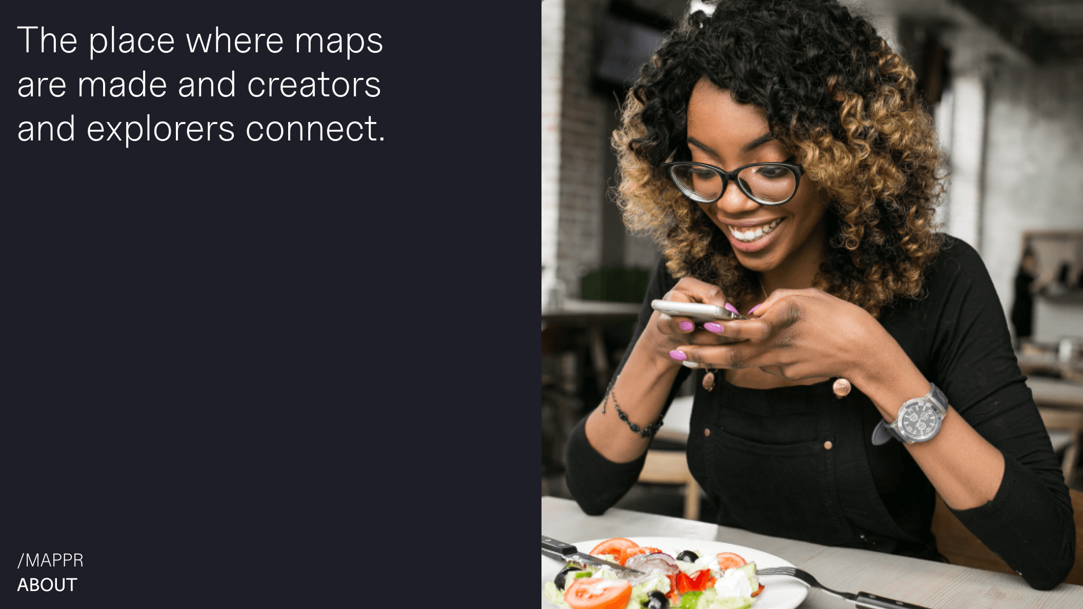
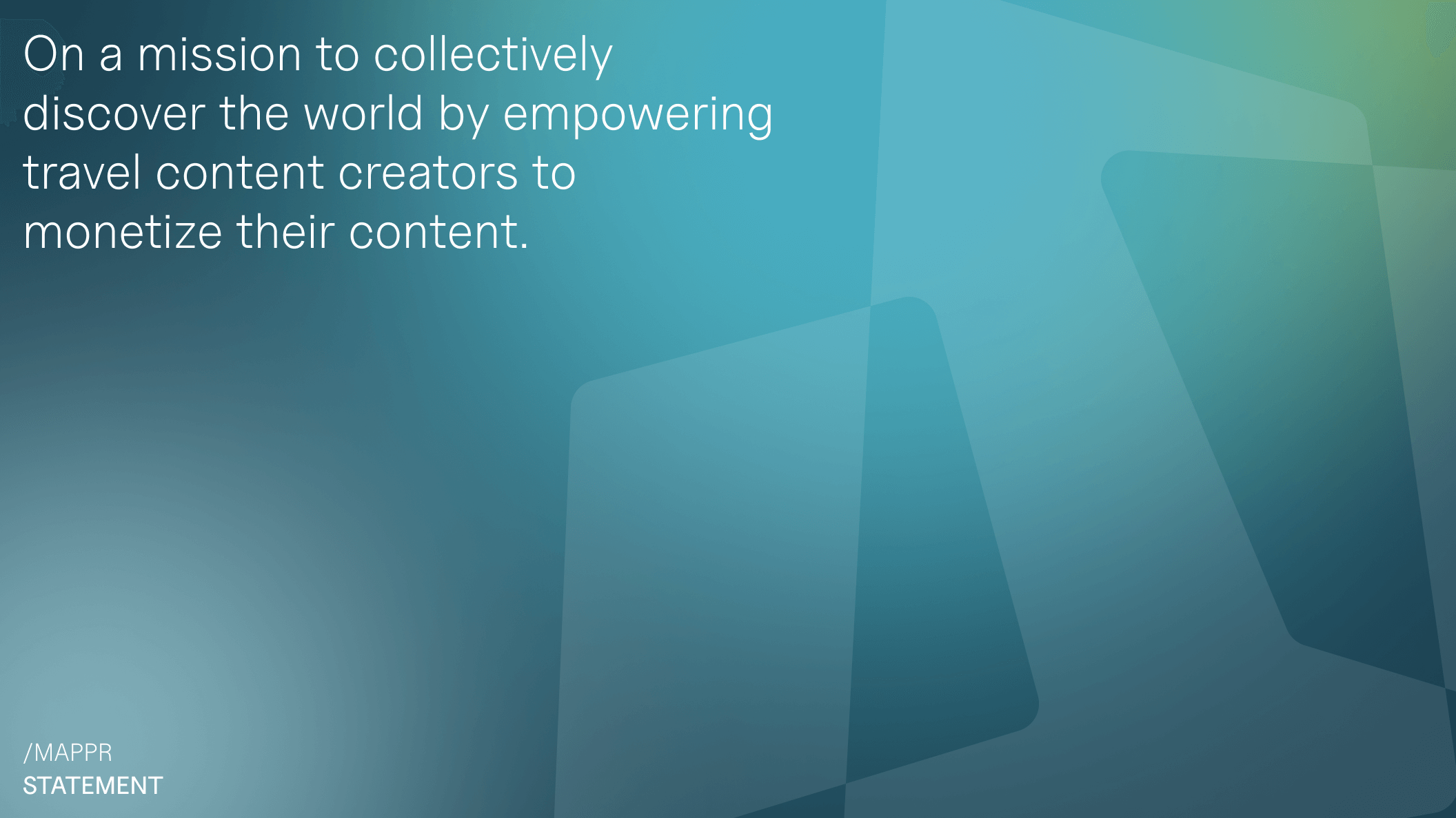
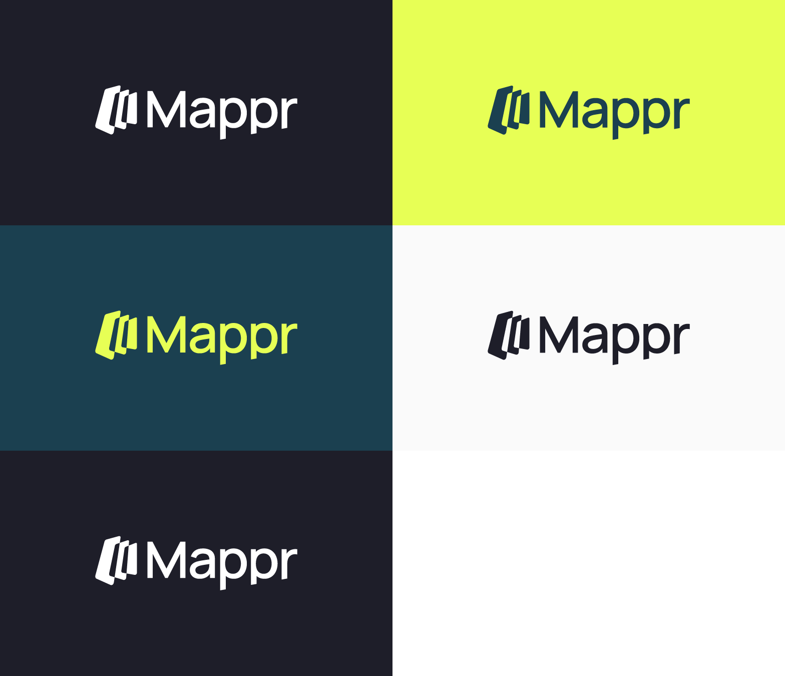
For Mappr, the map is the central element to build its community of creators and subscribers. It's a gateway to adventure, an opportunity to discover things. The startup's name was the starting point for the brand identity, which we built around the concept “Unfold the map”. It's a metaphor for expansion: We can explore new horizons and uncover all there is to discover. While representing the unfolded map, the rectangular shapes of Mappr's icon also resemble a mobile phone in perspective and overlap to create a sense of community and shared content, evoking a feeling of growth and connectivity.

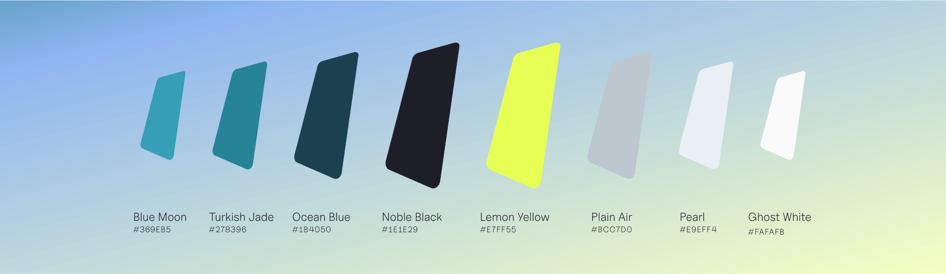
Mappr's color palette features vibrant hues of Teal, the sophistication of Black and White Glow, and the radiant lead color, Lemon Accent. These tones create a dynamic and refreshing vibe, making them ideal for a travel platform. They are vibrant enough to convey a sense of modern technology while being neutral enough to harmoniously coexist with content from creators.
For Mappr, we defined both a primary and a fallback font to ensure consistent and confident brand application across all touchpoints. Both typefaces are sans serif, belong to the neo-grotesque category, and deliver optimal results in both body text and headlines. The primary font is Uncut Sans, known for its high legibility and optimization for user interfaces. Additionally, it is free for commercial use. The fallback font, Inter, is versatile and designed for a wide variety of applications, from user interfaces to marketing materials. Its compatibility with Google Suite ensures correct formatting and proper brand usage across presentations and other marketing materials.
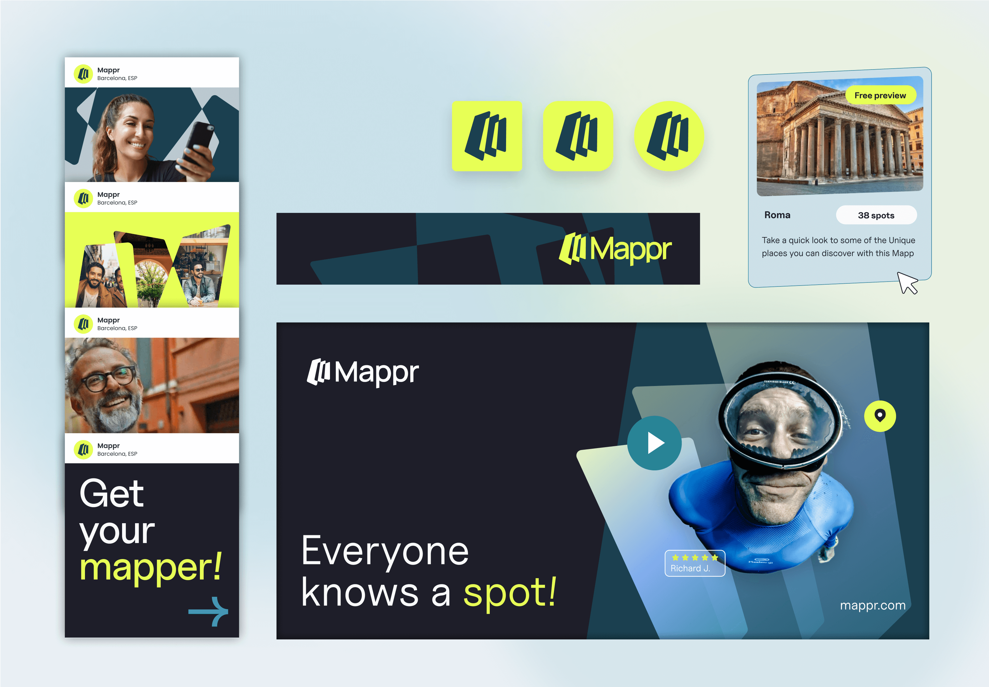
The brand concept “Unfold the Map” is applied across Mappr's imagery to enhance brand recognition. Starting with the logo, parallelograms and trapezoid shapes are created, reminiscent of a smartphone. These shapes can be used as frames or function as backgrounds. Photographs of people can be cropped to fit within the parallelogram boxes. For an attention-grabbing effect, subjects can extend beyond the box on multiple sides, or they can be contained within the box with the textural shape applied in the background. To ensure brand consistency, we defined a clear photographic style for the travel tech startup. With travel, food, and people at the forefront of Mappr, the photographs should embrace the diverse personalities of users. Images include people taking selfies with their phones, delicious dishes, and stunning landscapes. The subjects in the photos should genuinely enjoy what they do, reflecting authenticity and a strong connection with the brand.
Leveraging brand photographs, shapes, and its vibrant color palette, we designed how Mappr could be represented on social media and out-of-home advertising, as well as crafted a possible user interface of the platform. With all elements in place, Mappr is set to launch its platform soon, backed by a powerful travel brand poised to boost awareness and recognition.