
Tú lo ves; todos lo ven. En 2026, la mayoría de las marcas de IA carecen de personalidad.
Casi 70.000 startups de IA operando en el mercado1, el sector está inundado de identidades de plantilla y logotipos generados por IA, desde Silicon Valley hasta la región DACH. La homogeneidad es la norma; la personalidad, la excepción.
Ya hemos defendido anteriormente la importancia de construir una marca sólida, así que nos saltaremos los motivos. Este artículo trata sobre el cómo. Aquí tienes cinco marcas de startups de IA que lo están haciendo bien y lo que sus páginas web enseñan al resto del sector. Además, analizamos nuestros aciertos y errores (dos and don’ts) favoritos a la hora de crear una marca y una web de IA potentes.
1. Hummingbird
2. Juna
3. Featherless
4. New Generation
5. Lemni
Conclusiones: Qué más debes tener en cuenta para tu marca de IA
Preguntas frecuentes sobre branding para startups de IA
Las 5 mejores marcas de startups de IA
1. Hummingbird: Calidez en un sector basado en el miedo
Sector: Regtech, prevención de blanqueo de capitales (PBC)
Ubicación: San Francisco, EE. UU.
Ronda de financiación: Serie B
Atributos de marca: Precisa, cálida, ágil
Activos visuales propios: 3 (logotipo, formas de marca, estilo de imágenes)
Lo que nos ha gustado
Nombre
El nombre de la startup hace todo el trabajo antes de que leas una sola palabra. El cumplimiento normativo y la prevención de blanqueo de capitales suelen percibirse como procesos lentos, pesados y defensivos; un centro de costes que entorpece el negocio. Un colibrí (hummingbird) representa todo lo contrario: es pequeño, rápido, preciso y vuela manteniendo el control absoluto. El nombre redefine la categoría, transformando una carga en una combinación de rapidez, precisión y ligereza.
Colores
Casi todas las marcas de seguridad, compliance y prevención del fraude recurren por defecto al mismo registro frío: azul marino, azul eléctrico, paneles en modo oscuro y, de vez en cuando, el rojo de alerta. Hummingbird irrumpe con un tono coral cálido sobre fondo crema y consigue una estética editorial, humana y optimista en medio de un mar de azules. Ese contraste es su activo visual más potente. El cumplimiento normativo no tiene por qué parecer una sala de control de crisis.
Imágenes
En las esquinas se agrupan formas geométricas de líneas finas, nítidas y angulares. Cada una está construida a partir de segmentos entrelazados en ángulo recto, a medio camino entre un laberinto, un circuito impreso y una greca clásica. Desde el punto de vista conceptual, estos recursos aportan un gran valor a una marca de prevención de blanqueo de capitales: un laberinto de caminos es exactamente la representación de lo que supone rastrear dinero ilícito a través de una red de transacciones. Por tanto, el lenguaje visual de estas formas apela a la complejidad y a la búsqueda de rutas, complementando la ligereza y calidez que sugiere el nombre.
En la parte superior de la página de inicio se muestra un busto clásico grecorromano: una figura femenina de estilo Venus o musa, representada mediante un grabado en semitono. Está construida en su totalidad a partir de puntos finos y líneas tramadas en lugar de ser una fotografía. De esta propuesta técnica queremos destacar dos cosas. En primer lugar, el estilo de grabado con puntos y líneas es el lenguaje visual propio de las divisas (la técnica de calcografía utilizada para imprimir los rostros en los billetes de banco). Colocar una figura diseñada como si fuera dinero en una web de prevención de blanqueo de capitales es un guiño sutil e inteligentísimo. Aunque queda una duda: ¿entenderán todos los visitantes la indirecta?
Lo que no nos termina de convencer
La marca está ejecutada con mucha inteligencia y cada una de las formas tiene un significado claro. Sin embargo, recurre a demasiadas metáforas a la vez. Echamos en falta un concepto único y consistente que conecte el logotipo, el nombre y la identidad global de la marca. Por otro lado, las afirmaciones absolutas como «precisión del 100 %» o «el estándar de oro» terminan por restar valor a la confianza que la marca se gana. En estos casos, los datos específicos y demostrables siempre funcionan mejor que los superlativos.
2. Juna: Una tensión artística
Sector: Agentes de IA para procesos industriales
Ubicación: Berlín, Alemania
Financiación ronda: Seed
Marca atributos: audaz, cálida, futurista
Activos visuales distintivos: 2 (logotipo, imágenes industriales de matriz de puntos)
Lo que nos ha gustado
Nombre
El nombre de la empresa no tiene un significado literal vinculado al producto. Juna suena cálido, suave, casi humano. Sin embargo, se aplica a uno de los sectores menos suaves imaginables: reactores químicos, hornos de cemento, fábricas de celulosa y naves industriales. El contraste es drástico, pero forma parte de la esencia de la marca.
Logotipo
El logotipo resuelve esa tensión. JUNA es un logotipo tipográfico personalizado con letras gruesas y robustas, de esquinas recortadas que evocan el metal mecanizado: prensado, estampado, industrial. Así, un nombre cálido vuelve a anclarse en la fábrica. De un vistazo, los bloques tipográficos recuerdan incluso a una hilera de edificios. Funciona a la perfección tanto en blanco sobre degradado como en negro sobre blanco. Este es el activo visual diferencial que toda marca necesita.
Imágenes y pantallas de interfaz de usuario
Las imágenes del sector industrial están diseñadas con el mismo cuidado. Cada sector (desde el de bienes de consumo masivo o FMCG hasta el del cemento o el papel y la celulosa) se convierte en un objeto reconocible representado mediante una matriz de puntos en el color morado de la marca sobre un fondo casi negro. Este estilo evoca simultáneamente los datos y la señalización LED industrial. Transforma la producción física de una planta en objetos de datos, lo cual es la tesis central de Juna. Además, las ilustraciones simplificadas de la interfaz de usuario presentan las funcionalidades de la plataforma de forma clara y atractiva.
Lo que no nos termina de convencer
La paleta de colores y las capas
El degradado va del morado al magenta, pasando por el cian y el coral; es luminoso y casi iridiscente, con franjas de luz verticales que recuerdan a la luz a través de un cristal esmerilado o a una aurora boreal. La lectura estratégica es que representa todo lo contrario al mundo para el que trabaja Juna.
Las fábricas son grises, beige, de acero y color naranja flúor de alta visibilidad. La marca de Juna es brillante como un caramelo, suave, casi onírica. Es un movimiento deliberado, de alto riesgo pero con un gran beneficio potencial. ¿Tal vez simbolice la llegada del futuro a las fábricas grises? Estamos especulando. Lo que es seguro es que hace que esta startup de IA sea inconfundible en una categoría dominada por la monotonía del software industrial azul grisáceo.
Por otro lado, hay dos efectos visuales que compiten entre sí: el desenfoque de color del fondo y la cuadrícula de píxeles. Nosotros suavizaríamos uno de los dos para que la web resulte más fácil de digerir.
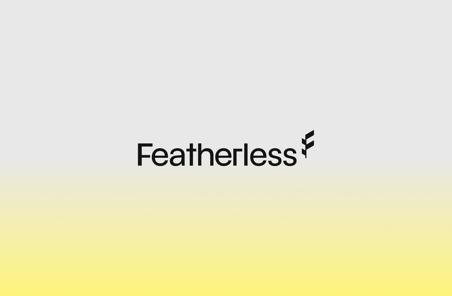
3. Featherless: La ligereza como estrategia
Sector: Infraestructura de IA de código abierto (open-source)
Ubicación: San Francisco, EE. UU.
Financiación ronda: Serie A
Marca atributos: autoritario, optimista, técnico
Activos visuales propios: 2 (logotipo, ilustraciones de marca)
Lo que nos gustó
Narrativa de marca
Featherless se enfrenta a un problema de mercado concreto: ¿cómo hacer que la infraestructura de IA se perciba como algo ligero en una categoría que ha acostumbrado a todo el mundo a esperar algo pesado? El origami responde a esto mediante una única metáfora física. Una hoja de papel apenas tiene masa; sin embargo, si se pliega con precisión, mantiene una estructura compleja y rígida sin necesidad de pegamento ni andamiajes. Esto se traslada perfectamente a su promesa técnica: resultados listos para producción sin la carga de una infraestructura gestionada tradicional. Esta narrativa de marca impregna todo el apartado visual y deja mucho margen para la creatividad.
Sistema de ilustración
El sistema de ilustraciones materializa el producto. Comienza con líneas de plegado discontinuas y planas (el plano inicial) y se transforma en formas de papel plegado en tres dimensiones tanto en la sección principal (hero) como en las tarjetas de los modelos. Así, las instrucciones planas se convierten en una estructura funcional. Cada faceta es un pliegue, lo que evita que la geometría parezca el típico diseño low-poly genérico. Este sistema de ilustraciones de marca está diseñado para escalar la creación de futuras imágenes, potenciando la consistencia de la identidad visual de la startup.
Colores
Un amarillo cálido, bautizado como Solar Feather, se mantiene constante tanto en el modo oscuro como en el claro dentro de una categoría tecnológica que suele vivir atrapada en interfaces oscuras y cerradas. Funciona como un faro que aporta claridad a sistemas opacos; transmite autoridad y optimismo al mismo tiempo.
Tipografía
La combinación tipográfica demuestra un gran gusto visual y un enfoque clarísimo hacia su público objetivo: los desarrolladores. Una tipografía con serifa cálida, casi literaria, para los titulares convive con una fuente monoespaciada (muy del ecosistema developer) en la navegación y los botones. El mensaje que transmite es que la herramienta está hecha para personas que viven en la terminal de comandos, pero sin resultar fría.
Lo que corregiríamos
Aunque el sistema de marca de Featherless está pensado para ser escalable, los elementos visuales de su blog se desvían de la línea gráfica principal de la identidad.
4. Nueva Generación: Un sistema completo hecho de una sola forma
Sector: Plataforma de comercio con IA
Ubicación: San Francisco, EE. UU.
Financiación ronda: Seed
Marca atributos: prémium, editorial, segura
Activos visuales propios: 1 (forma de isotipo)
Lo que nos ha gustado
Combinación de logotipo e imágenes
El isotipo de la startup consiste en un pequeño conjunto de cuatro barras verticales de distintos grosores situado a la izquierda del logotipo tipográfico. Esas mismas formas de paneles verticales se repiten en los iconos de las funcionalidades: paneles con una flecha, un círculo o un marco. Por tanto, el isotipo no es un elemento aislado, sino la base de un pequeño sistema geométrico, y esa consistencia ayuda a generar reconocimiento de marca.
El enfoque de las imágenes
La galería de la sección principal realiza un trabajo silencioso de posicionamiento. Se muestran cinco bloques verticales con retratos sobre perfumes, cuidado de la piel, alta joyería, diseño de interiores y ropa deportiva; todas ellas categorías premium de compra meditada y fotografiadas con un gusto exquisito. Esta selección te dice exactamente a quién se dirige: a marcas aspiracionales de belleza y estilo de vida, no al comercio minorista convencional.
CTA
El isotipo animado en la CTA que se encuentra al final de la página de inicio es elegante y a la vez llamativo. Refuerza a la perfección las formas de los paneles verticales.
Lo que podría mejorarse
Los cambios entre el modo claro y oscuro
La página web de la startup pasa de forma drástica de un tono crema cálido a un fondo casi negro. Ese cambio tan abrupto te hace pensar, por un momento, que estás entrando en una sección o un contenido completamente distintos.
Nombre
El nombre es ingenioso pero poco eficaz en la práctica. New Generation contiene un triple significado muy interesante (nueva era, generativo y nueva generación), pero resulta genérico, es difícil de posicionar en buscadores y complicado de registrar como marca comercial.
Activos distintivos
El isotipo es su único activo visual distintivo. La identidad de esta marca de IA ganaría mucha fuerza si contara con un color de acento complementario.
5. Lemni: Cuando el producto es la marca
Sector: Marketing, agentes de IA para atención al cliente
Ubicación: Ámsterdam, Países Bajos
Ronda de financiación: Pre-seed
Personalidad de marca: tecnológica, calmada, urbana
Activos visuales propios: 0.5 (conexión nombre-isotipo)
Lo que nos ha gustado
Nombre
El nombre de esta startup de IA lleva implícita su propuesta de valor. Lemni es el diminutivo de lemniscata, el término matemático con el que se designa al símbolo del infinito. Los mensajes de la web conectan directamente con esto: la página de inicio te pregunta qué experiencia vas a ofrecer ahora que dispones de una fuerza de trabajo infinita, y todo su argumento de venta gira en torno a escalar el negocio sin necesidad de aumentar la plantilla.
Las pantallas de la interfaz de usuario (UI)
La página web apenas incluye formas o recursos gráficos propios de la marca; en su lugar, está construida a partir de la propia interfaz del producto animada en alta fidelidad: bandejas de entrada con solicitudes de asistencia reales, tarjetas de contacto, el panel de configuración del agente de IA y ventanas de diálogo para aprobar o rechazar acciones. El producto es el auténtico protagonista visual de la página de inicio, complementado por un vídeo de fondo sutil que suma en lugar de distraer.
La página de empresa (About us)
¿Quién dijo que ya a nadie le importa el equipo que hay detrás de una empresa? Con su página corporativa, Lemni demuestra lo contrario: aquí es donde reside la calidez de la marca. Resulta humana y accesible, algo completamente necesario teniendo en cuenta que no aparece ninguna persona en el resto del sitio web.
Lo que podría mejorarse
Logotipo
Tenemos que decirlo: el degradado en blanco y negro del isotipo no es una buena práctica de diseño. Se emborrona por completo al reducirse al tamaño de un favicon (el icono de la pestaña del navegador) y hace que el símbolo del infinito sea difícil de reconocer. Nosotros apostaríamos por una opción más simple, eliminando el degradado y definiendo mejor sus contornos.
Personalidad
A pesar de que las pantallas de la interfaz y las animaciones nos parecen fantásticas, a la marca de esta startup le falta una narrativa sólida que logre transmitir todo su valor potencial.
Conclusiones: qué más debes tener en cuenta para tu marca de IA
Recomendación: Elige tu tipografía con inteligencia
Featherless adapta su tipografía a su público de desarrolladores, y esto no es una excepción. Las marcas de startups de IA adaptan su tipografía a su sector, al igual que Fearn hace: Operan en la industria legal y de patrimonio, y esto es visible en su tipografía serif de carácter autoritario. (También en sus imágenes).

Arito, una startup de Fintech, incluso tiene su fuente personalizada.
Atrévete a crear tensión
Aunque ciertos elementos (como la tipografía o el logotipo de Juna) encajen con el sector, es totalmente lícito romper con los clichés de la categoría en otros aspectos. El cumplimiento normativo no tiene por qué ser frío. El software industrial no tiene por qué ser gris. Las mejores marcas de IA identificaron esa convención que todo el mundo espera, la rompieron a propósito y luego construyeron un sistema escalable en torno a esa idea.
Construir el sistema de marca a partir de una única semilla
New Generation desarrolla todo un conjunto de iconos de funcionalidades a partir de un único trazo de barras verticales. Featherless pliega cada ilustración basándose en una sola idea de origami. Una única forma o metáfora propia que se repita a lo largo de la web es infinitamente mejor que cinco recursos decorativos sin relación entre sí.
No satures el concepto
El punto débil de Hummingbird es el exceso de metáforas: el colibrí, las formas de laberinto y el busto de billete de banco no terminan de conectar entre sí. La coherencia entre los diferentes puntos de contacto es lo que hace que una marca sea fácil de descifrar.
No te conformes con un aspecto de plantilla (que pueda asustar)
Una startup de preparación de entrevistas con IA utiliza una sección principal oscura con demasiado texto en blanco y colores genéricos; el resultado es que la imagen superior (above the fold) se percibe como fría, casi tétrica, antes de que logres entender qué ofrece el producto. Parece una plantilla prediseñada, no una marca.
No crees un isotipo sin una historia
Una startup de herramientas para desarrolladores cuenta con un icono distintivo, pero no hay nada que lo relacione con el resto de la marca. Además, el punto de acento del icono desaparece por completo en tamaños pequeños.
No confundas el blanco y negro con autoridad
El blanco y negro se asocia a la autoridad, y ahí radica la trampa. Da sensación de seguridad, por lo que todo el mundo recurre a él. Sin embargo, la autoridad en monocromo es una fórmula prestada, no construida. Los gigantes del mercado pueden permitirse eliminar el color porque el público ya los conoce; una nueva startup de IA, muy probablemente, no. El derecho a vestir de blanco y negro se gana una vez que tienes reconocimiento; antes de eso, los elementos de color son esenciales para aportar personalidad.
Preguntas frecuentes sobre branding para startups de IA
¿Existen agencias de branding para startups que se especialicen en marcas de IA?
Le preguntamos a ChatGPT. Y esto fue lo que respondió:
Sí. Actualmente existe un nicho creciente de agencias que se dirigen específicamente a startups de IA, empresas de infraestructura de IA, plataformas de agentes, productos LLM y negocios SaaS habilitados por IA.
Una distinción útil: agencias de branding nativas de IA
Estas entienden los productos de IA, los compradores de IA, las preocupaciones sobre la adopción de IA y el posicionamiento de IA.
Ejemplos: The Branx, Phable, Poplab, ALETRA.
Agencias de branding tradicionales con experiencia en IA
Se trata de consultoras de marca más grandes que han trabajado con empresas de IA, pero no se centran exclusivamente en ellas.
Un ejemplo notable es Koto, la agencia detrás del reciente cambio de marca de Leonardo.Ai, que reposicionó la empresa en torno a la creatividad humana en lugar de la estética genérica de la IA.
¿Cuál es el precio medio de contratar una agencia de branding para startups?
Los precios de mercado para una marca de startup suelen oscilar entre 20.000 y 80.000 euros, según TechCrunch. En The Branx, ofrecemos una alternativa liderada por expertos: un equipo dedicado de un director creativo, dos diseñadores expertos y un gestor de proyectos dedicado integrado en tu proyecto. Obtienes una renovación completa de estrategia y diseño, además de un Centro de marca interactivo impulsado por IA diseñado para escalar sin esfuerzo junto a tu producto. A partir de 25k $.
¿Cuánto tiempo se suele tardar en crear una identidad de marca para una startup de IA?
Las agencias pequeñas ofrecen sprints de branding de dos semanas, mientras que los estudios de diseño de primer nivel tardan meses. En The Branx combinamos lo mejor de ambos mundos: ofrecemos una ejecución de diseño ágil, liderada por personas y acelerada por IA. Desde la estrategia hasta la identidad de marca y el manual interactivo con función de chat, todo el proceso está guiado por expertos.Las startups desde la fase Seed hasta la Serie B y startups de IA y SaaS lo consiguen en un proyecto de 4 semanas.
Contáctanos para saber más.
1Source: https://www.startus-insights.com/innovators-guide/how-many-ai-companies-are-there/
.jpg)