Cloud savings with AI-powered FinOps
North ayuda a las empresas a reducir su factura cloud hasta un 50% mediante optimización con IA en AWS y GCP. Una única plataforma diseñada para el control, el ahorro y la escalabilidad.
Cerca del 40% del gasto cloud se pierde debido a una gestión financiera deficiente. North resuelve esta brecha con un enfoque FinOps especializado. Tras cerrar una Series A de 5 millones de dólares, la compañía presentó su copiloto de IA para FinOps: Noros. Dirigimos el naming del producto, desarrollamos la identidad visual de Noros y redefinimos la marca North para alinearla con su nueva propuesta de valor.

Concept & Strategy
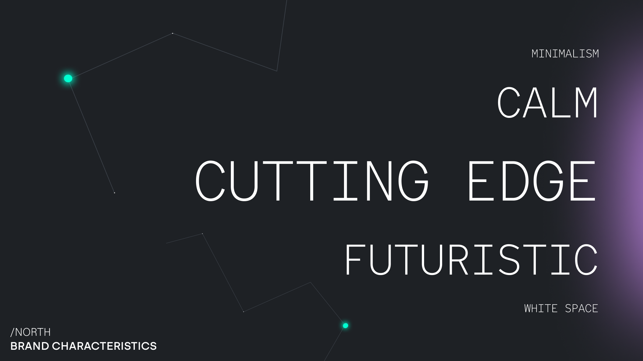

La identidad visual de North se fundamenta en la Estrella Polar y las constelaciones del cielo nocturno. Al igual que la Estrella Polar sirve como guía inmutable, North proyecta dirección, estabilidad y control en el ecosistema del FinOps impulsado por IA. El sistema de diseño se define por una estética contenida y vanguardista (tech-forward). Sus retículas minimalistas, formas precisas y un movimiento sutil crean una presencia serena pero imponente. La marca construye un entorno que envuelve al producto: elementos inspirados en el universo, como las constelaciones, enmarcan la experiencia y transmiten conceptos de escala, navegación y claridad. North no es solo una plataforma, sino una guía para la toma de decisiones financieras en infraestructura cloud. El sistema de diseño está orientado al crecimiento futuro, permitiendo una integración fluida de sub-marcas como el copiloto de IA, Noros.
Logo
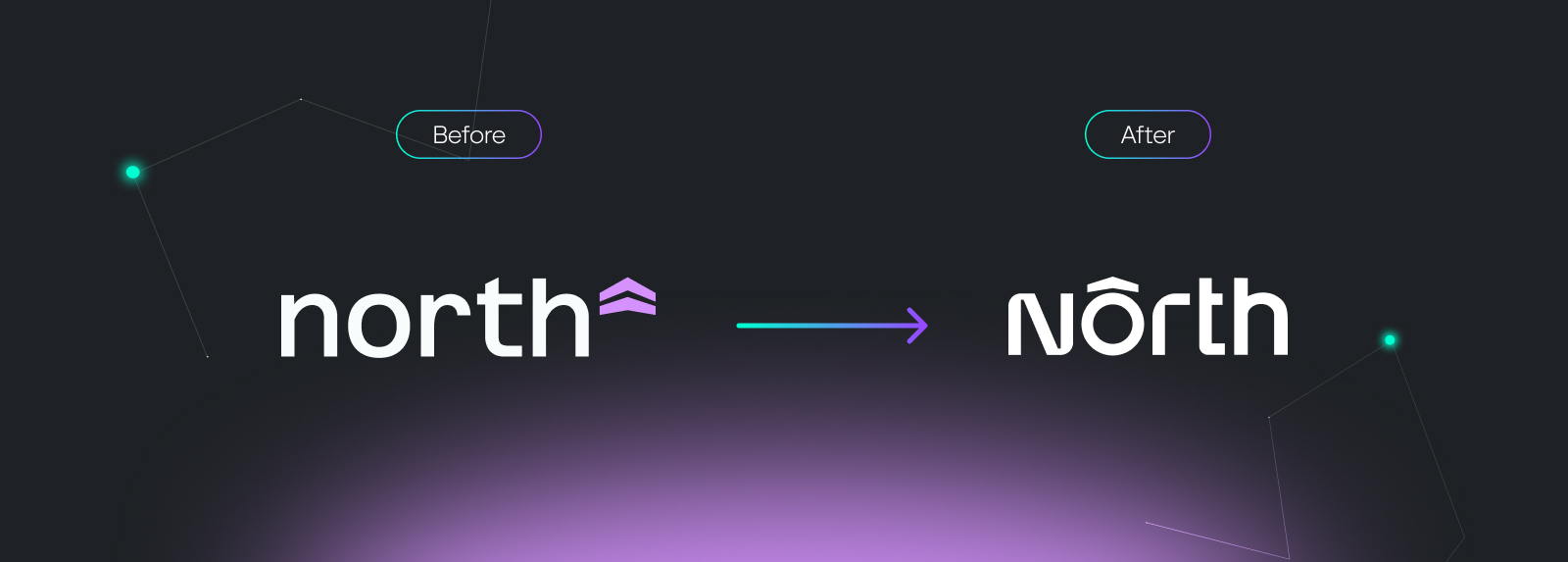
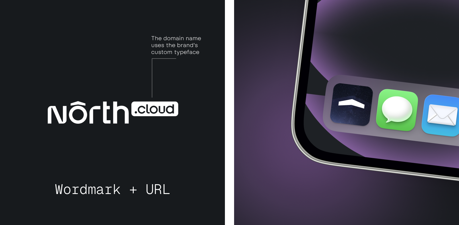
Como parte de la evolución de la marca, rediseñamos el logotipo de la startup con un carácter más técnico. La tipografía personalizada combina bordes redondeados y afilados, creando una estética precisa y distintiva que refleja la naturaleza analítica del producto. La flecha sobre la 'o' se mantiene del logotipo original como referencia directa a la idea de 'norte' como dirección y guía. Este elemento funciona ahora como un isotipo independiente, garantizando el reconocimiento de la marca en todas las interfaces y touchpoints. Para reforzar el recuerdo de marca, introdujimos además una composición flexible que integra el dominio .cloud.
Tipografía
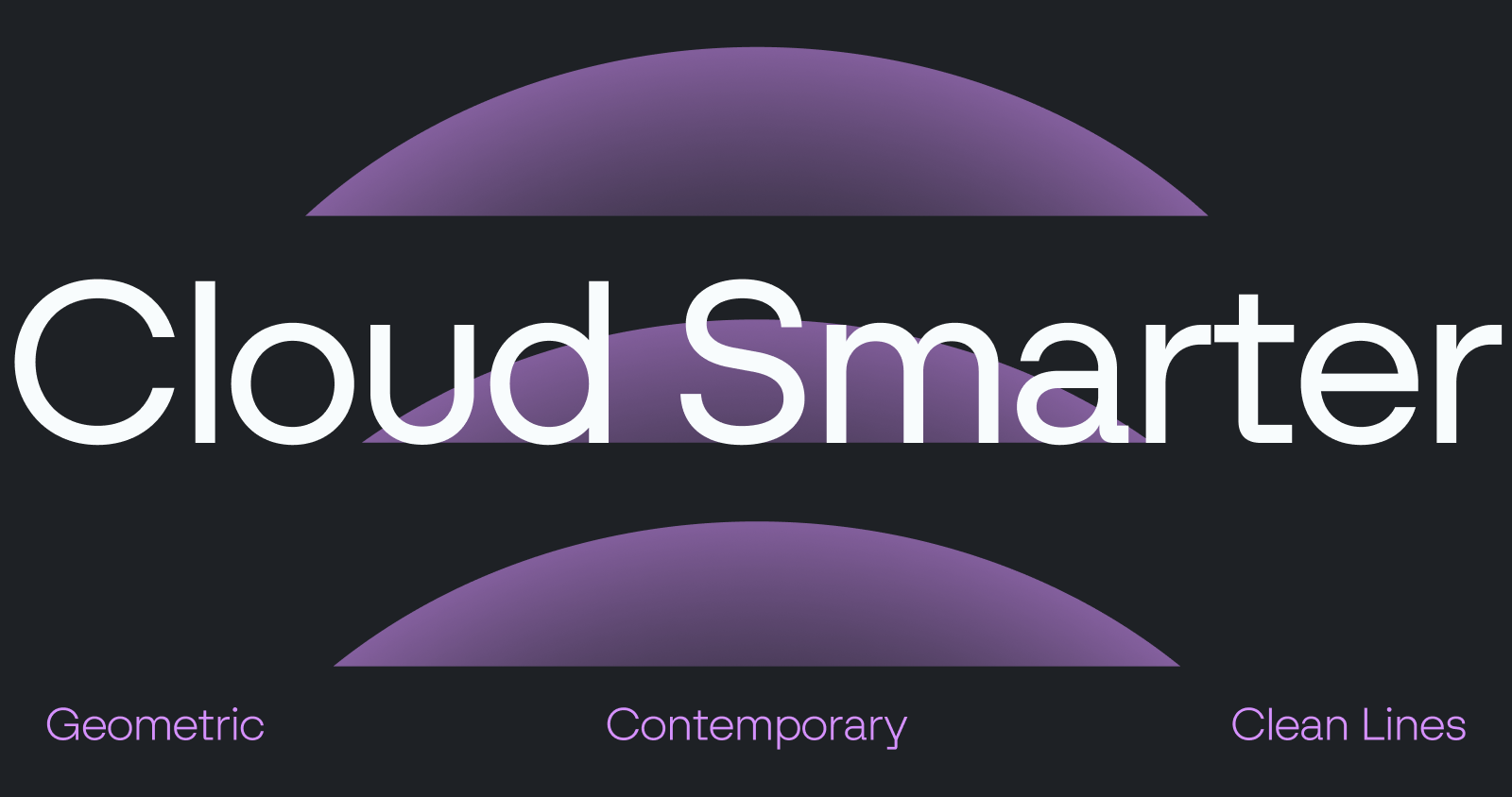
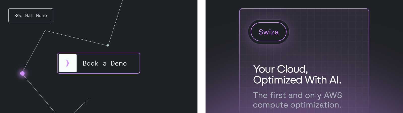
North utiliza Swiza como tipografía principal: una sans-serif que destaca por sus líneas limpias y su excelente legibilidad. Para dotar a los textos de mayor personalidad, Red Hat aparece como el complemento perfecto. Esta fuente se caracteriza por su geometría, una gran altura de la x, un ancho más condensado y uniones finas. Se utiliza en sobretítulos, titulares y CTAs en todos los canales de la marca.
Imágenes
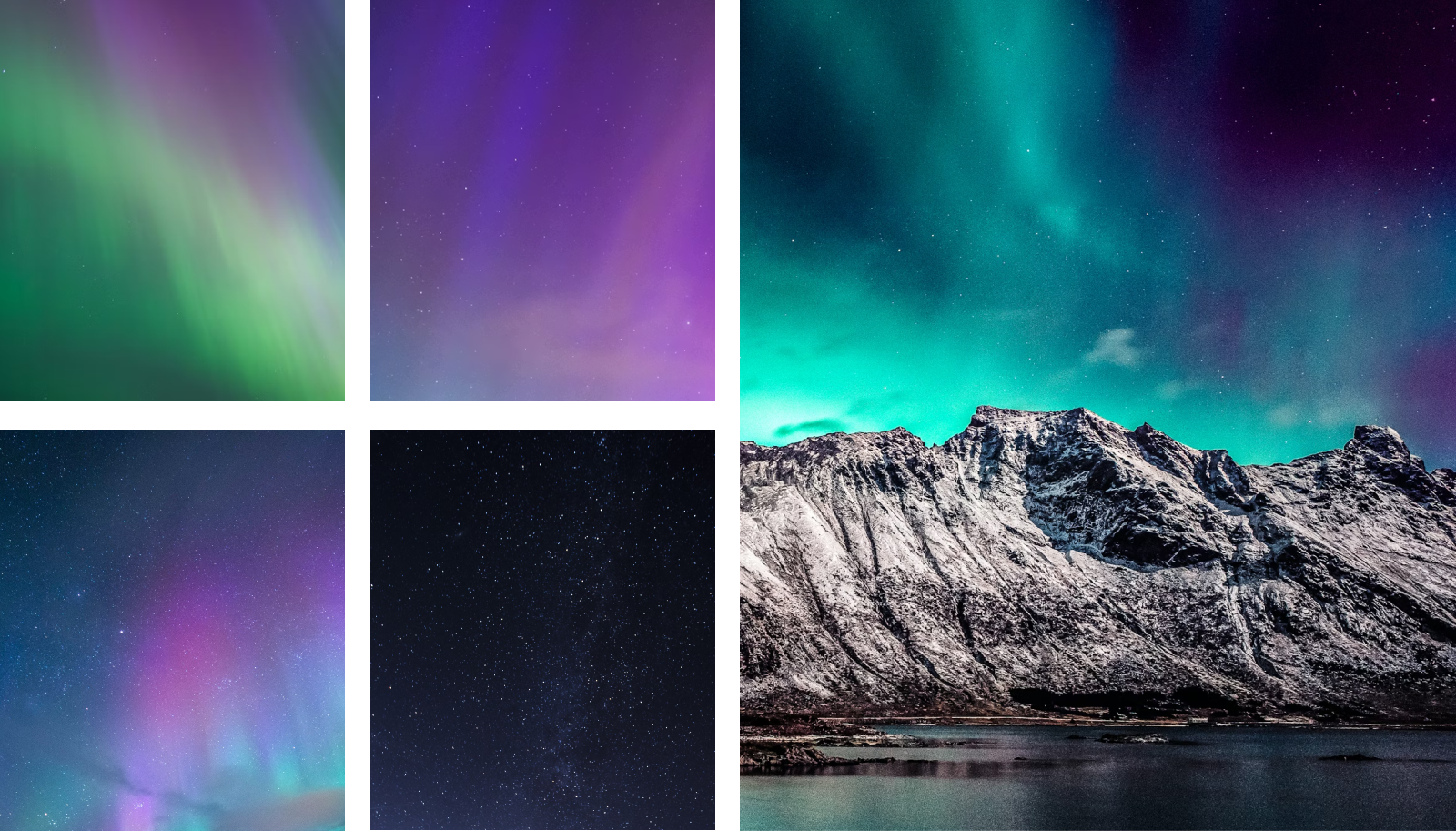
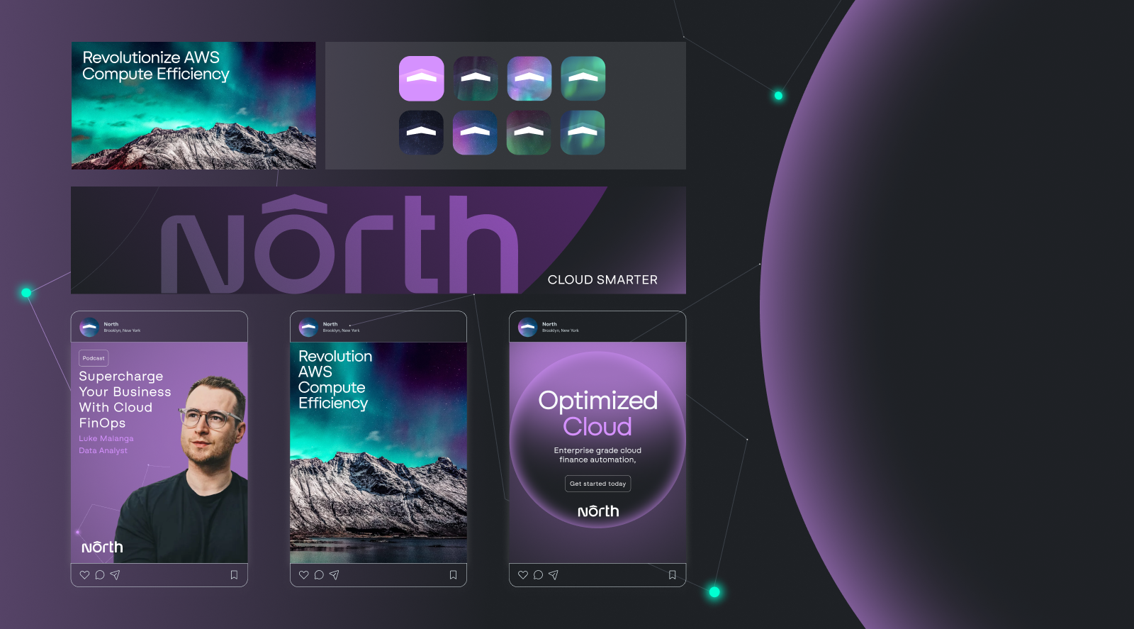
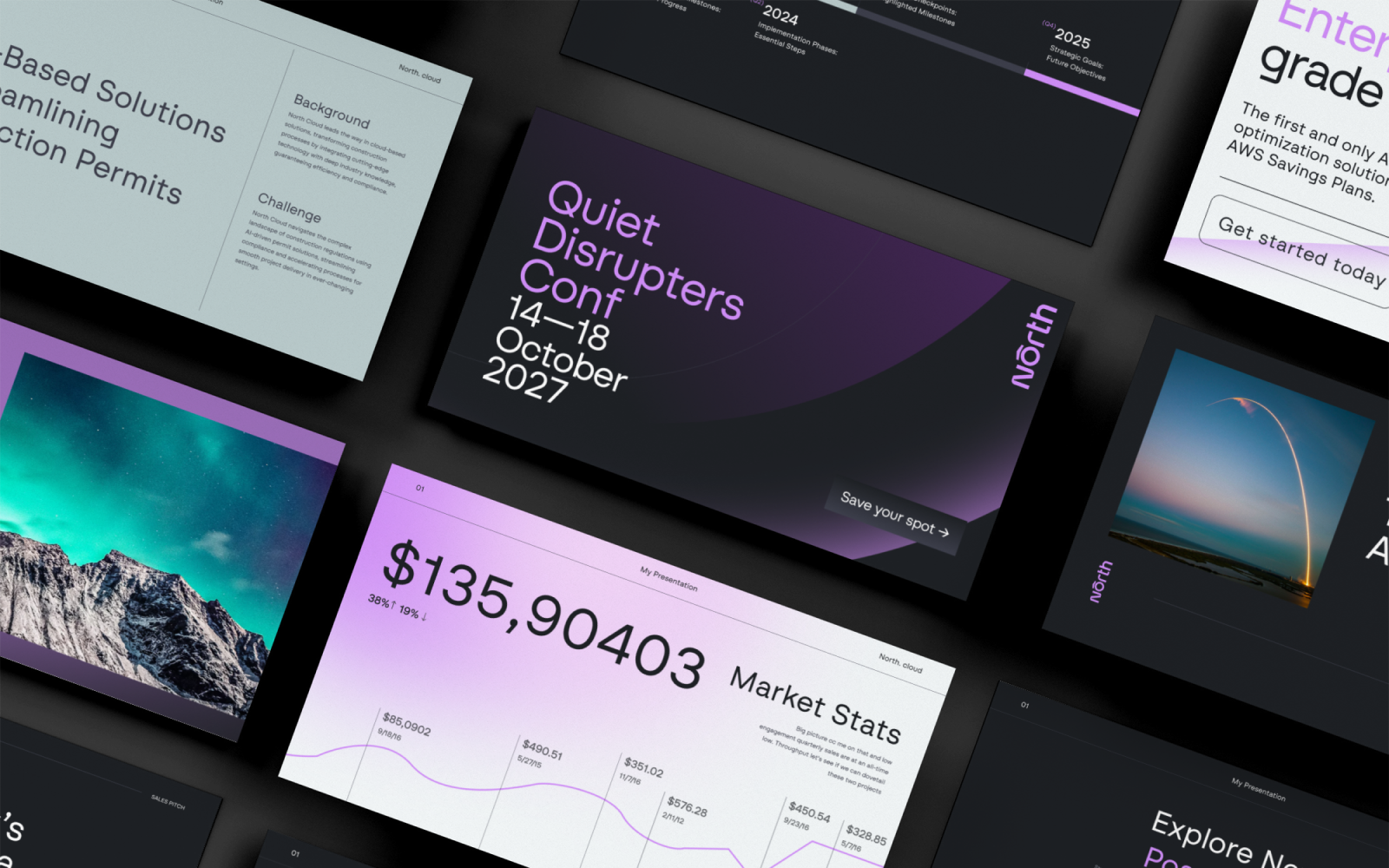
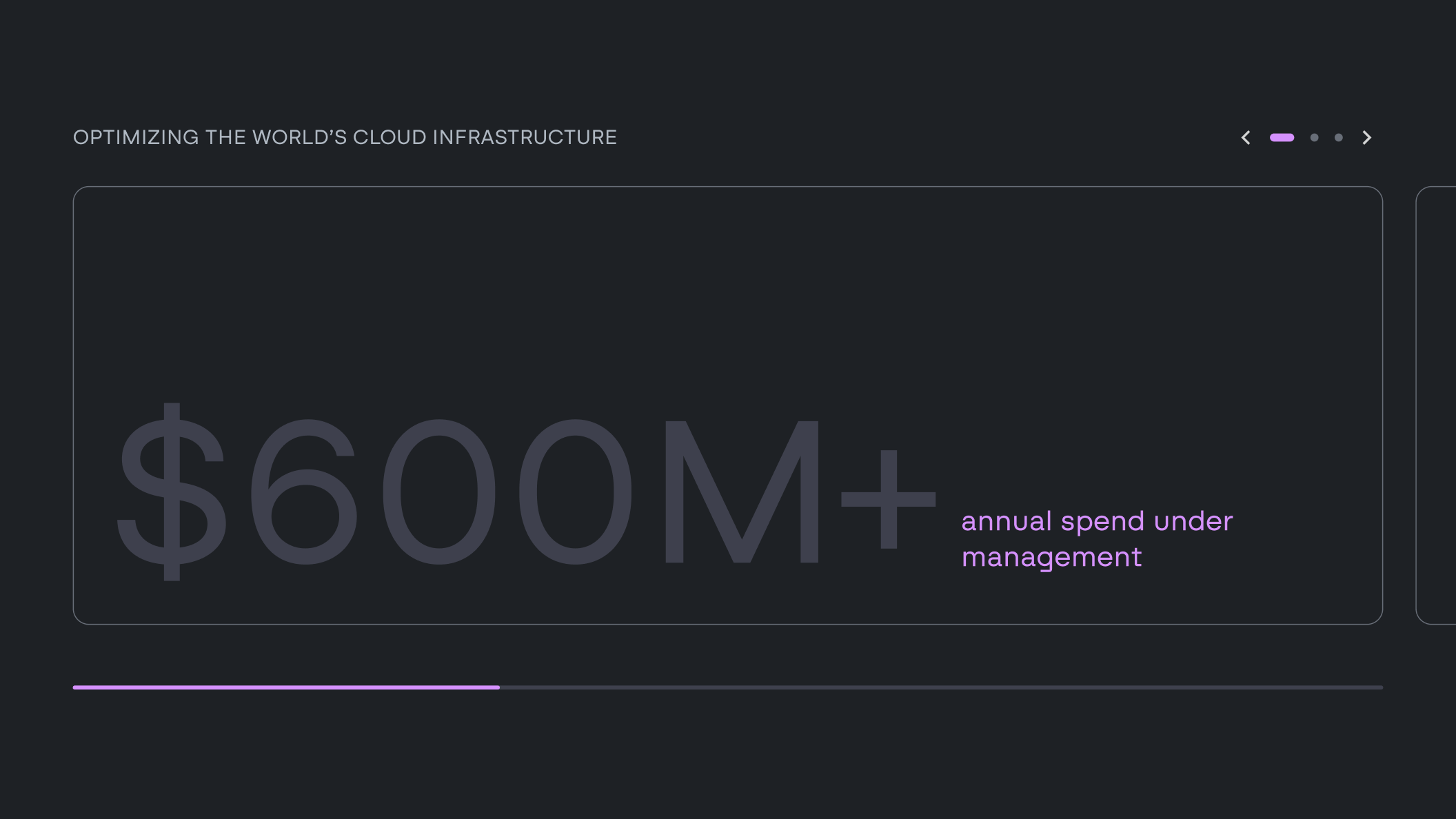
El brand refresh introduce un sistema visual inspirado en las auroras boreales. Estos fondos atmosféricos se aplican en los touchpoints clave, creando un entorno de marca coherente y reconocible. Los visuales, que evocan el movimiento de una aurora, refuerzan el concepto universal de la identidad, aportando profundidad y dinamismo al conjunto.
Web
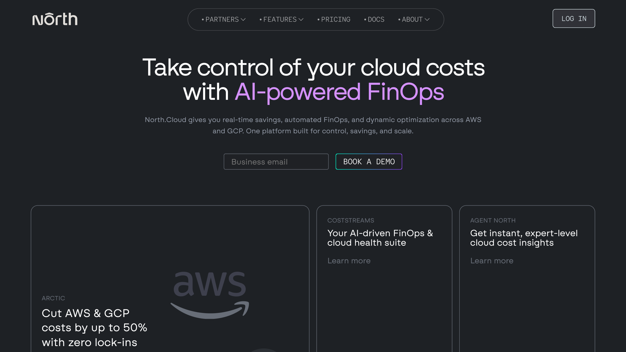
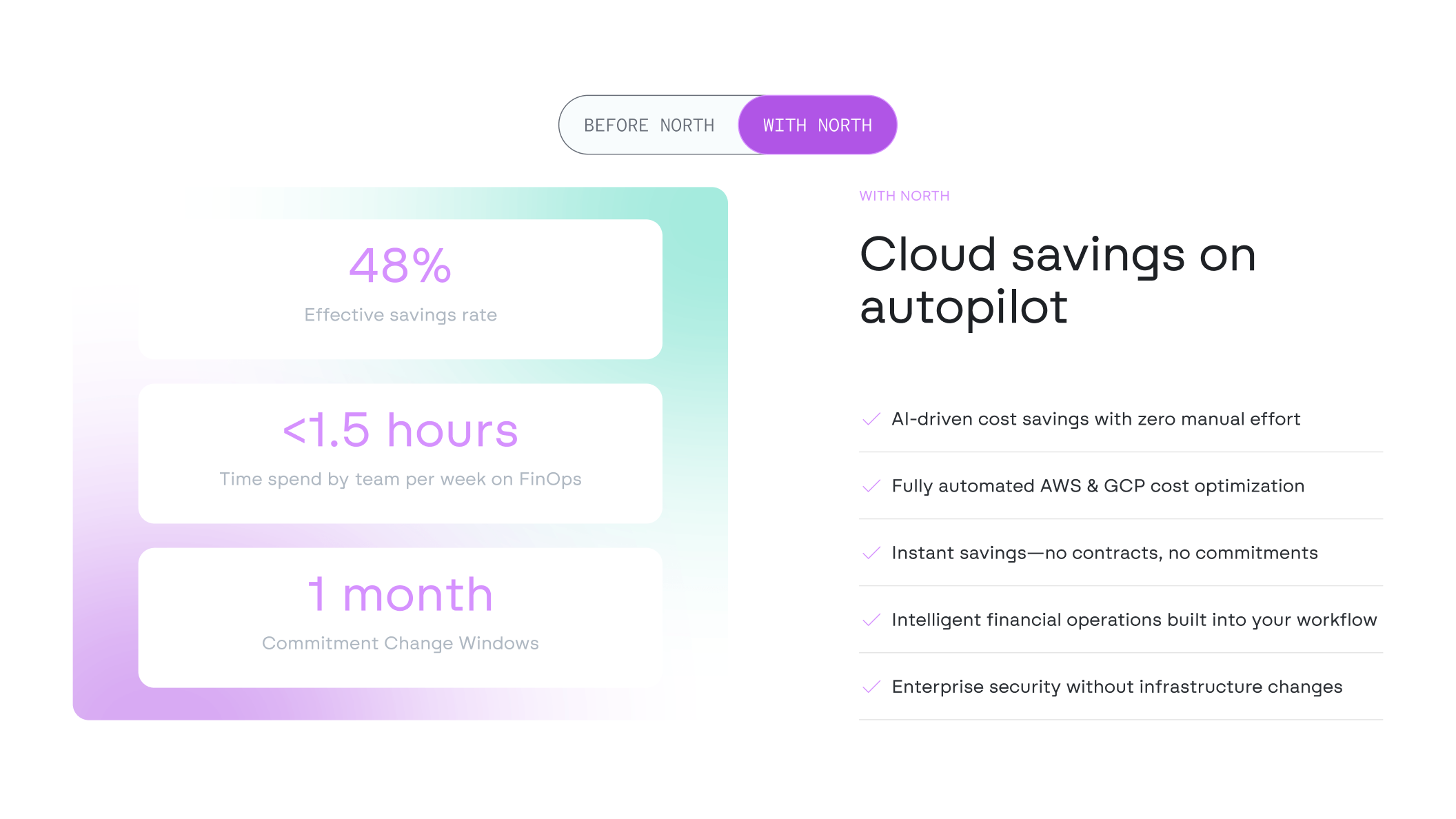
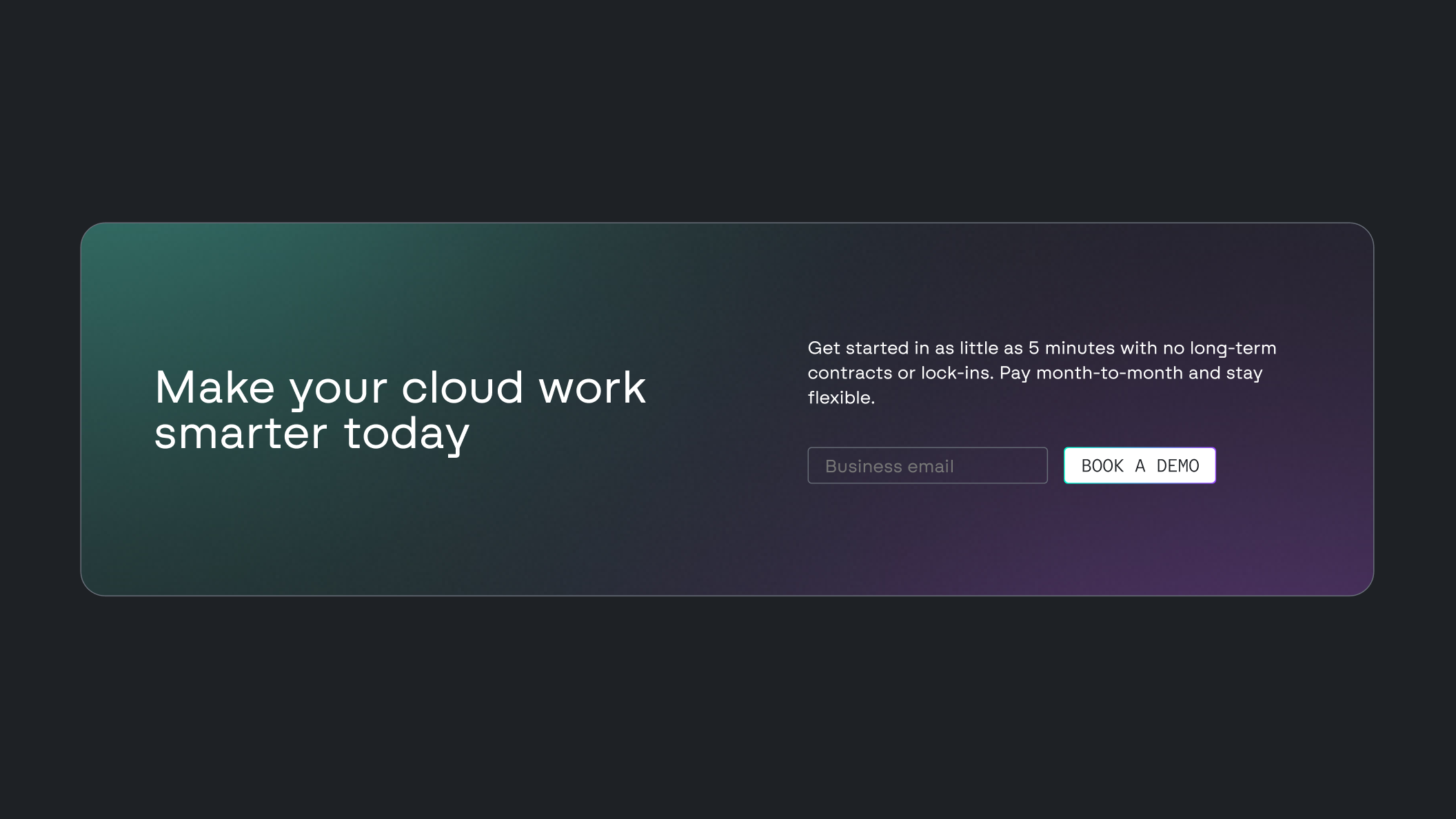
La web de North está diseñada para comunicar el valor del producto con claridad y precisión. El foco reside en la funcionalidad, mediante retículas estructuradas que resaltan las características de la plataforma y facilitan la toma de decisiones. Una interfaz en modo oscuro, combinada con acentos en el distintivo color Nebula, refuerza un entorno técnico y bajo control. Este enfoque visual se alinea con las expectativas de los productos de FinOps y Enterprise Cloud. Las interacciones tienen un propósito claro. El uso de microanimaciones y estados hover sutiles guían la navegación y mantienen el engagement sin generar ruido visual. Las integraciones narrativas añaden contexto, ayudando a los usuarios a comprender cómo funciona la plataforma y dónde genera un impacto real.
UX / UI
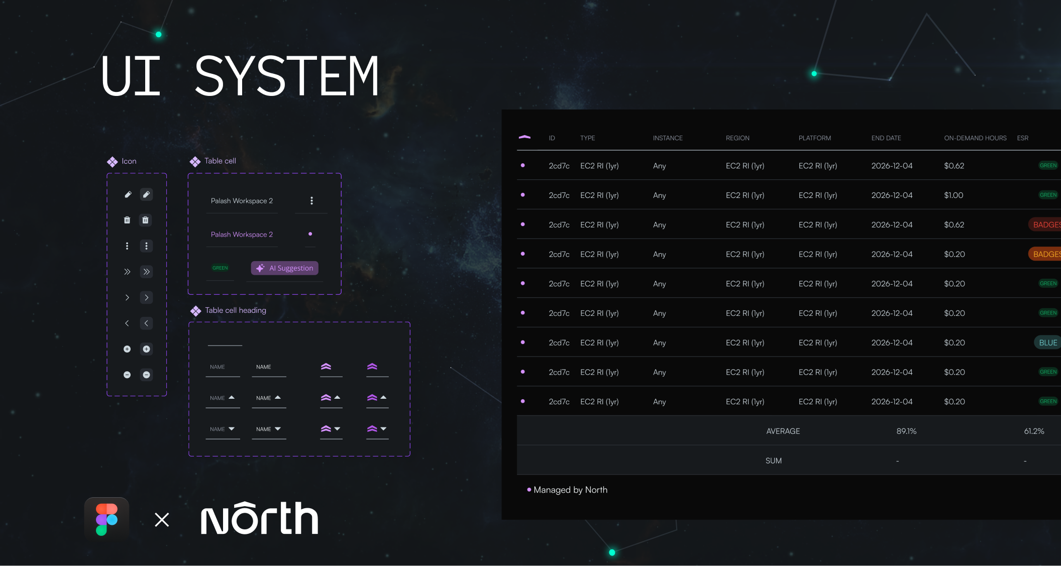
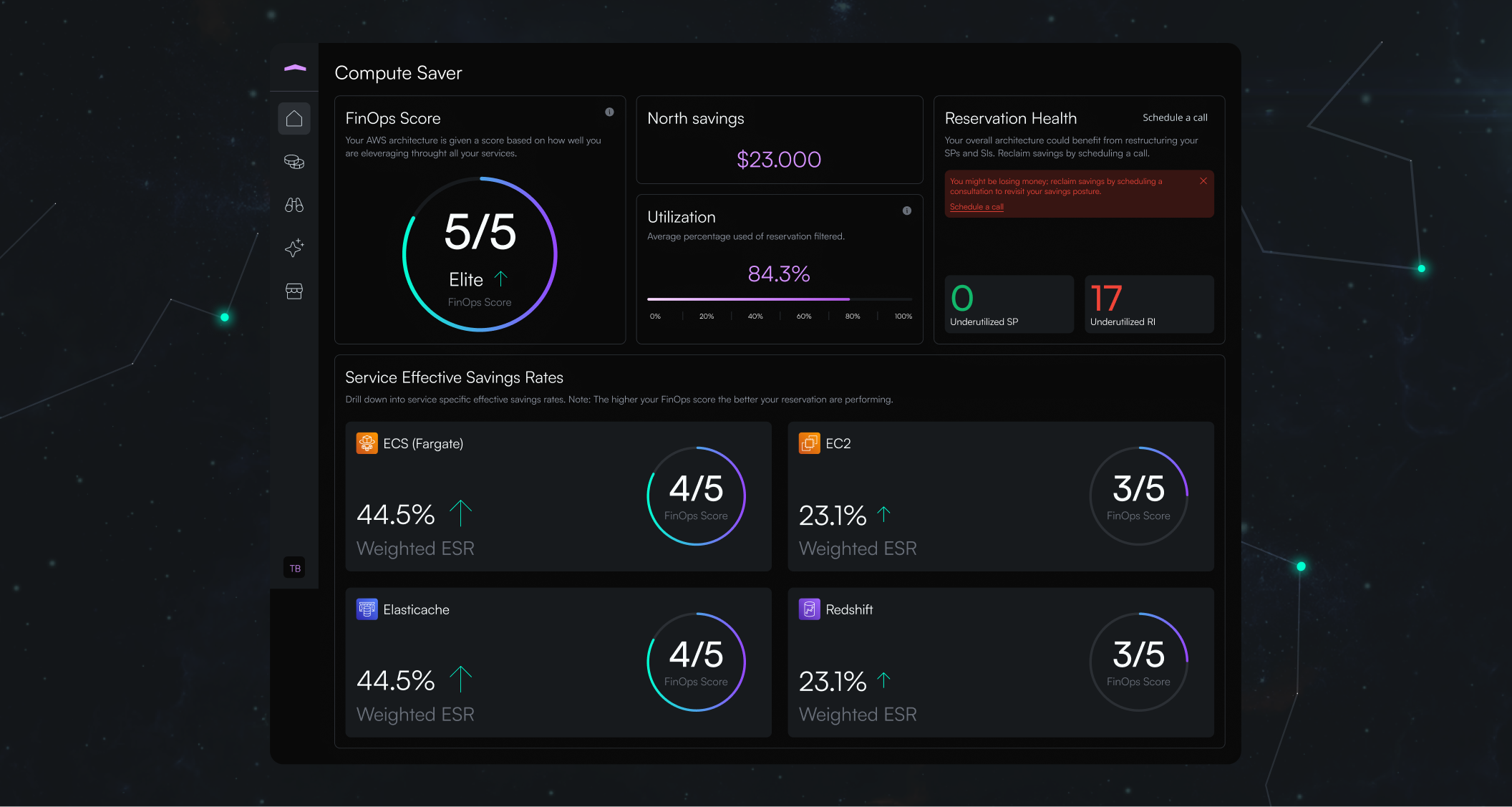
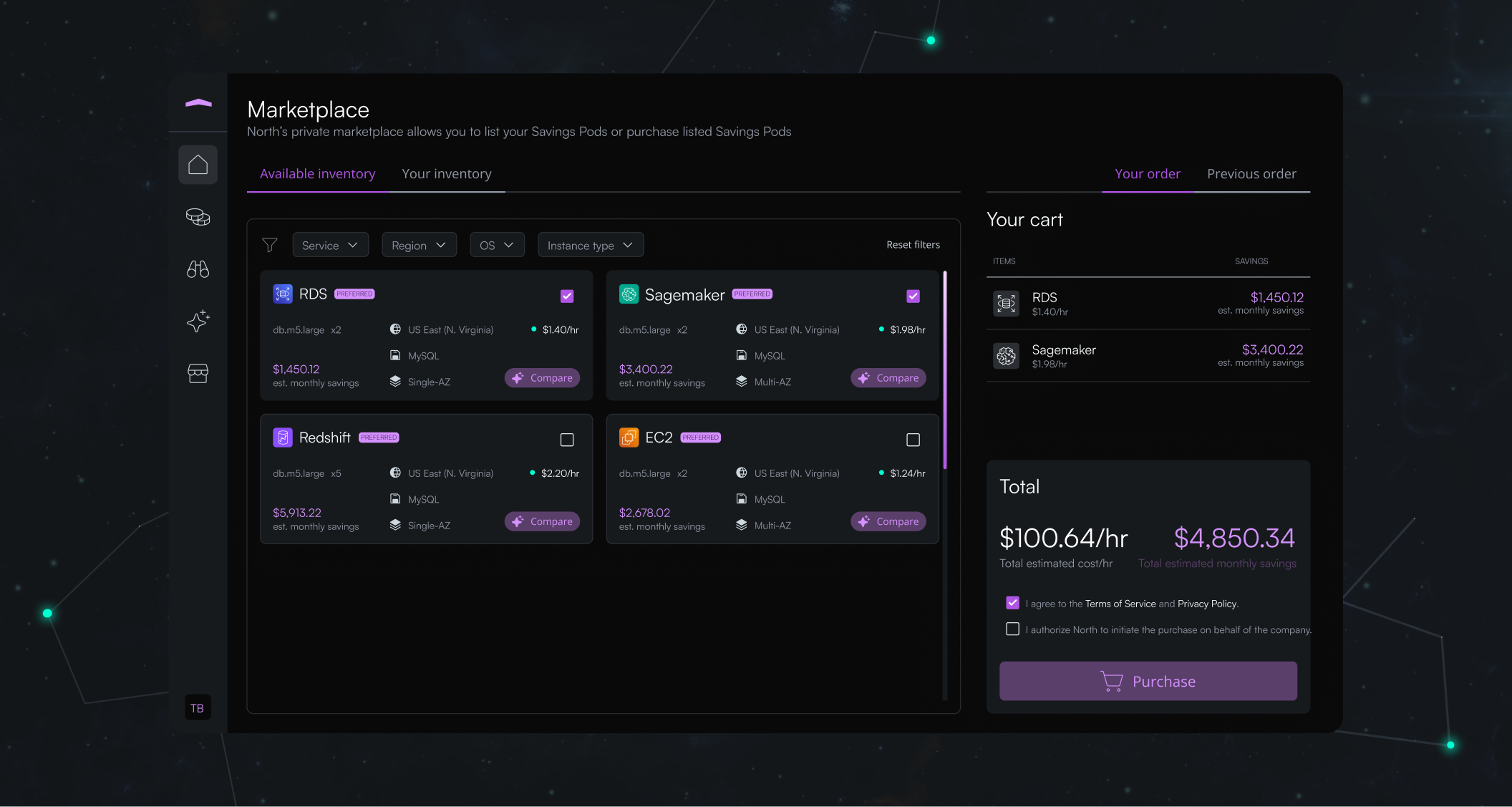
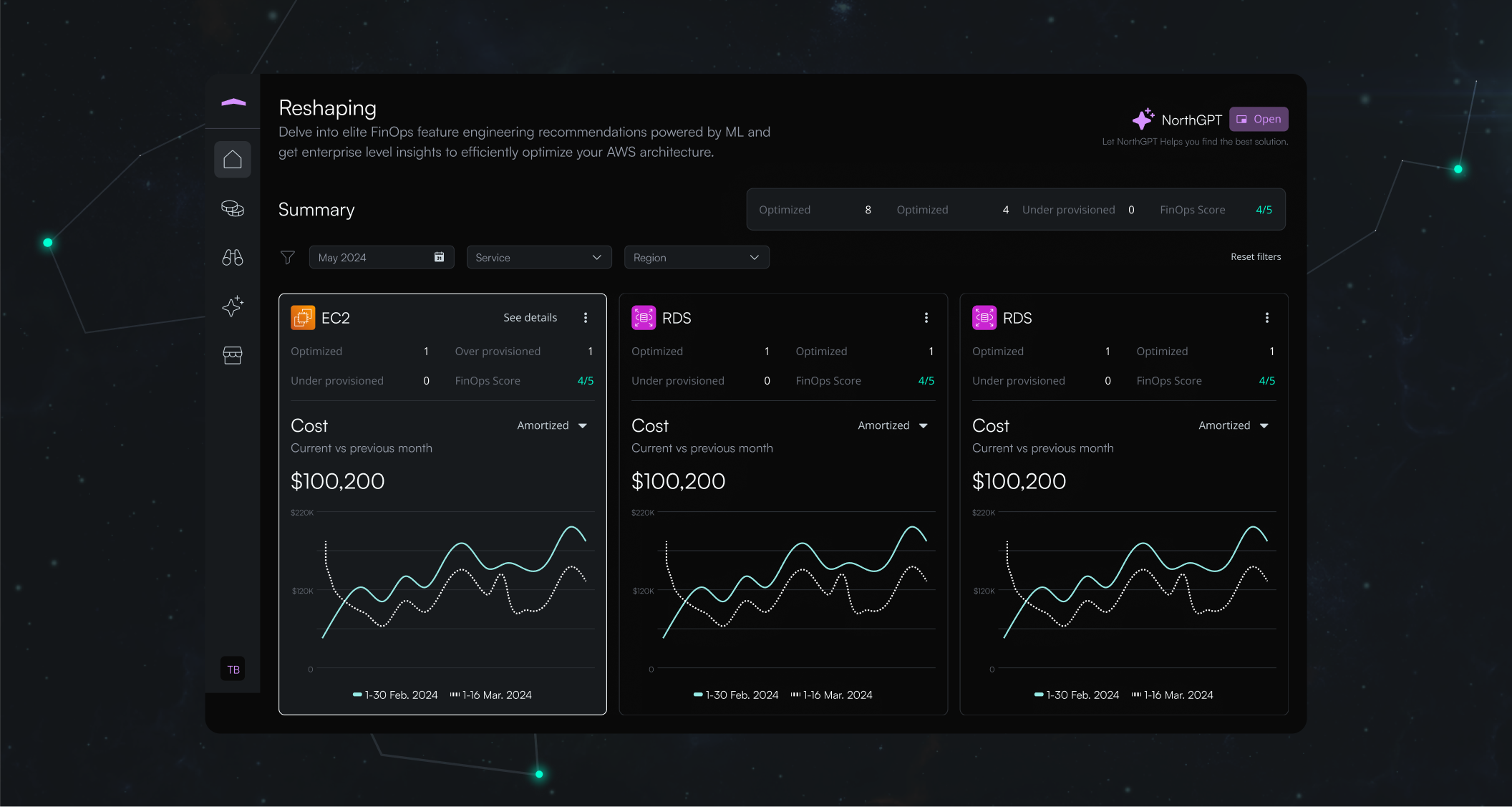
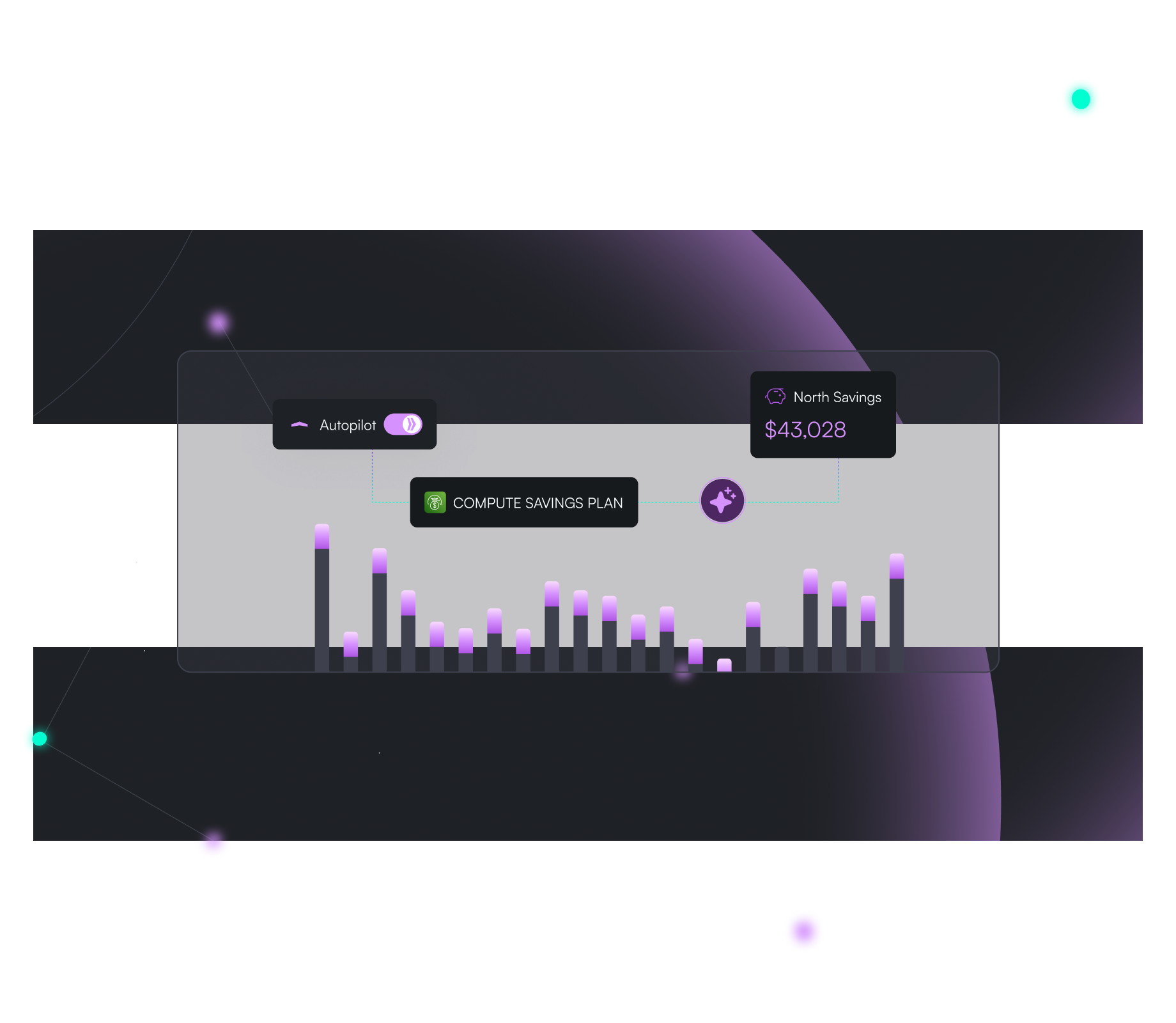
En línea con la estrategia de marca, desarrollamos el sistema de diseño UI de North. Desde la pantalla de inicio de sesión hasta el marketplace, la interfaz integra diversos indicadores y gráficas de rendimiento. El tema oscuro predominante no solo reduce la fatiga visual, sino que potencia la visibilidad de los iconos y el texto. El púrpura actúa como color de acento para resaltar información clave, como los importes de ahorro y los botones, dirigiendo eficazmente la atención del usuario hacia los datos críticos. En todo el sistema se mantiene una jerarquía tipográfica clara, utilizando fuentes de mayor peso para los titulares y estilos regulares para las descripciones y detalles técnicos.
Noros: The AI Copilot for FinOps
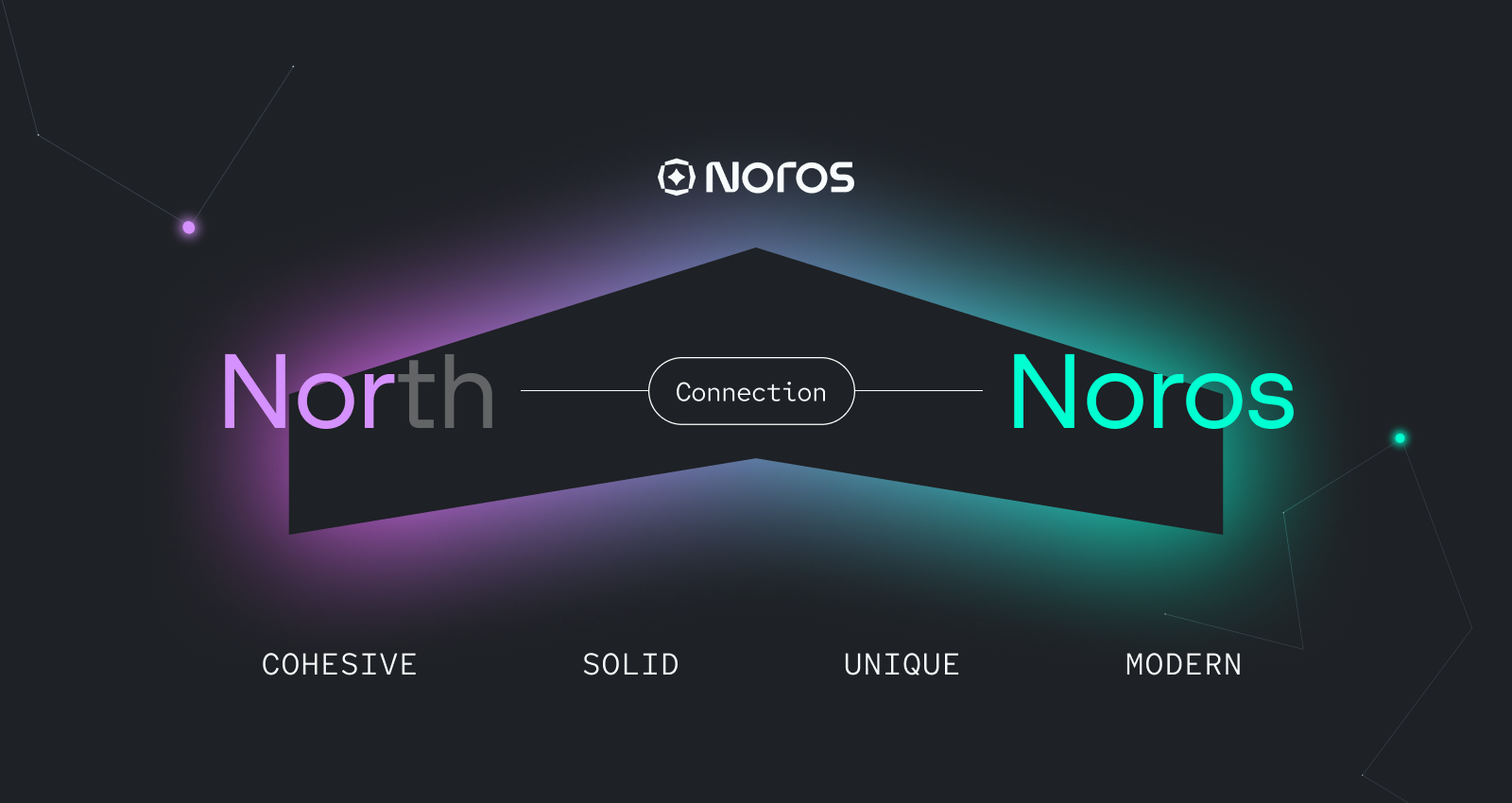

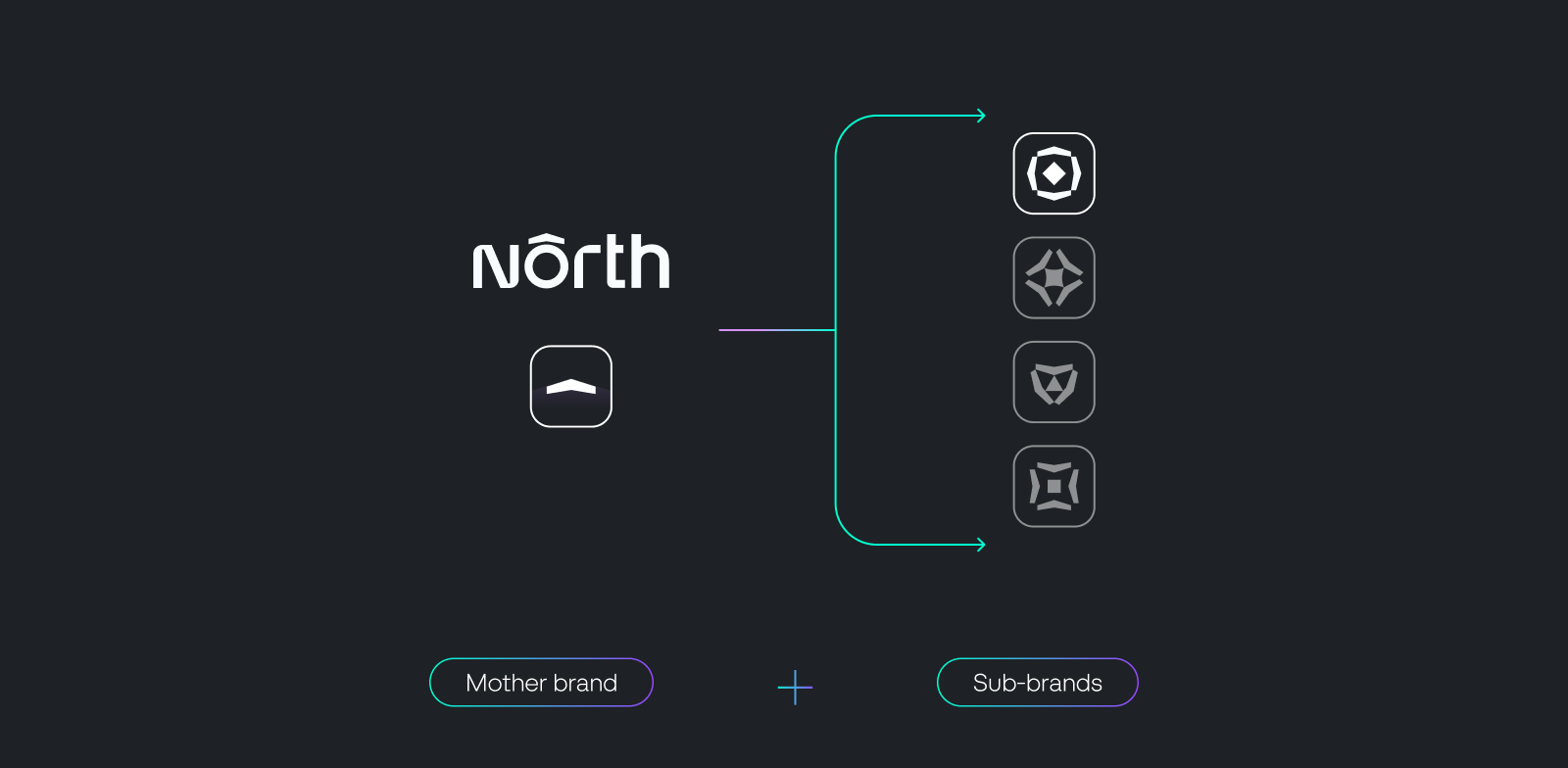
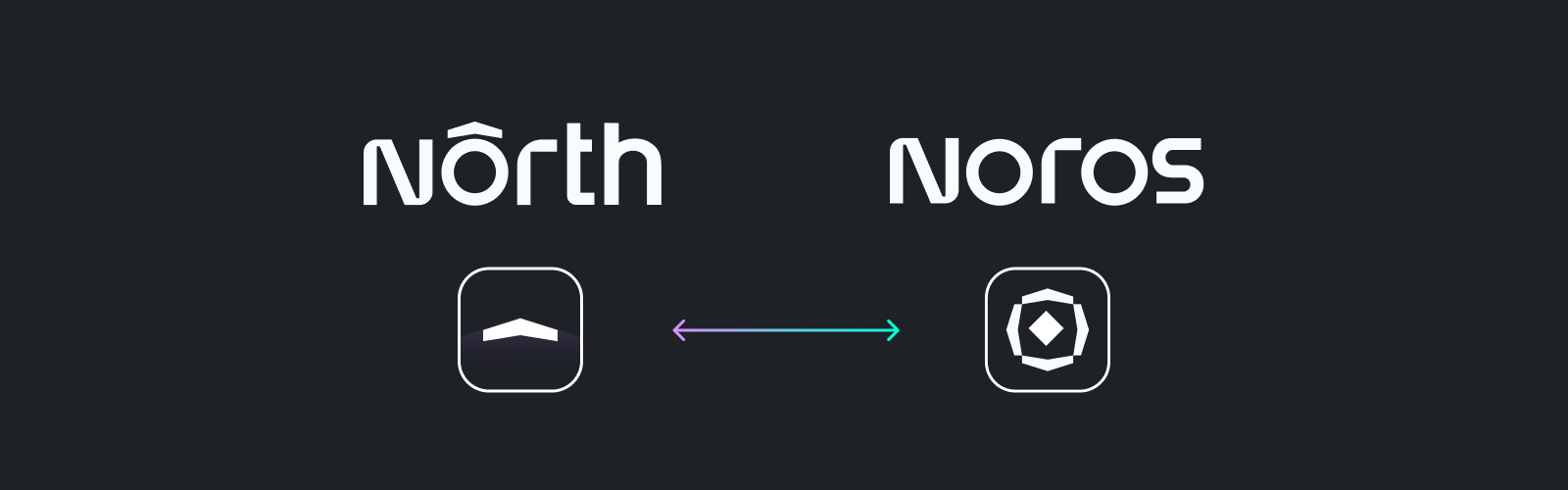
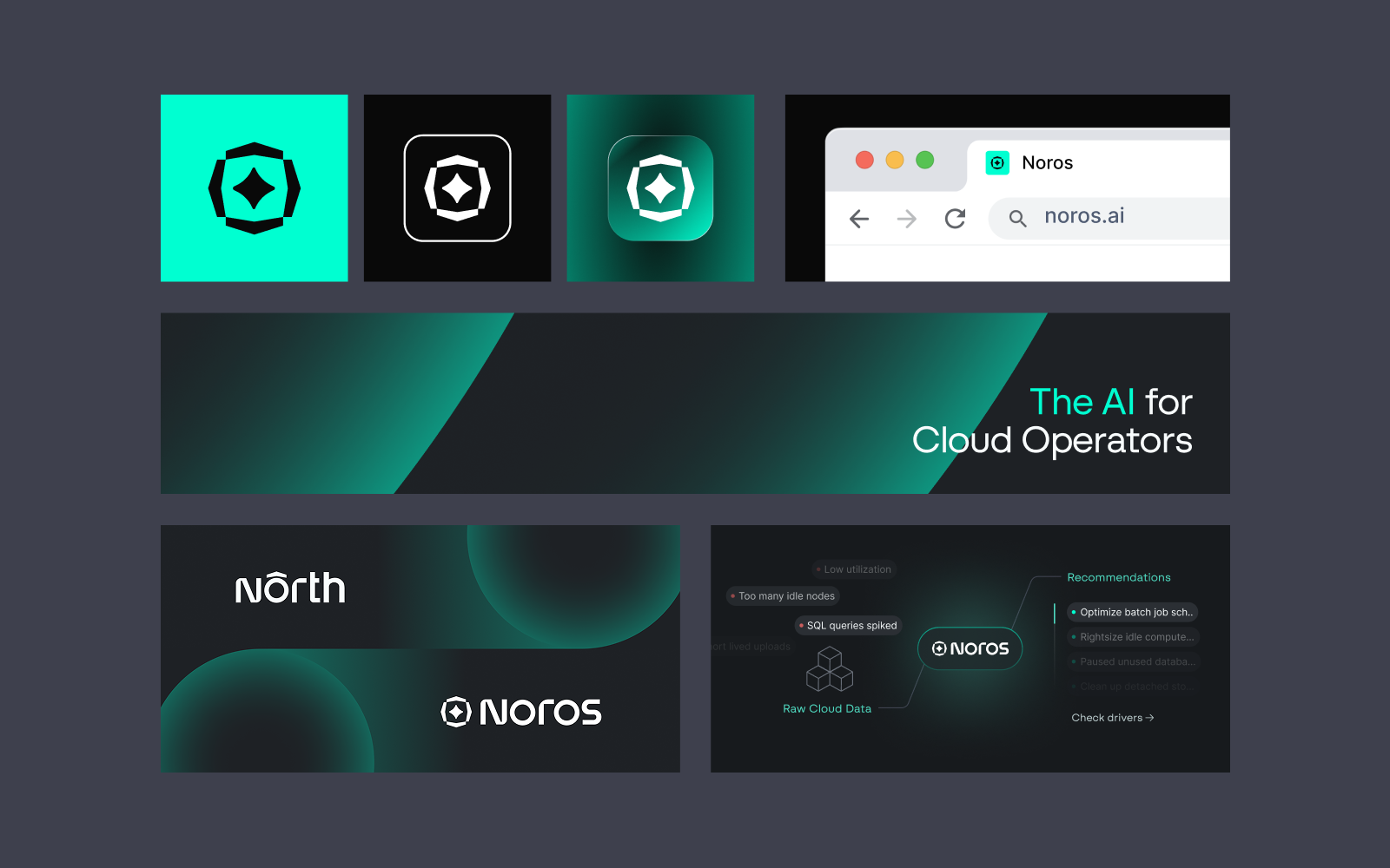
Para el nuevo producto de North, su copiloto de IA para FinOps, dirigimos un proceso de naming estructurado centrado en la claridad, la diferenciación y el encaje con la marca. El resultado es Noros. El nombre equilibra personalidad y relevancia: tiene un carácter propio pero mantiene la coherencia con el concepto universal de la identidad. Fonéticamente, Noros se alinea con North, creando un vínculo claro en la arquitectura de producto y reforzando la cohesión de marca. Su tono es moderno, preciso y ligeramente futurista, sin perder la profesionalidad necesaria en entornos cloud corporativos. Tras la creación de Noros, desarrollamos una identidad de sub-marca alineada con el sistema principal de North. La base visual y conceptual se mantiene constante, garantizando la continuidad en todo el ecosistema de producto. El logotipo hereda el mismo estilo tipográfico y, a partir de la flecha de la marca madre, nace el isotipo de Noros. El color menta, rescatado de la paleta original de North, aporta reconocimiento a la vez que distingue a Noros dentro del sistema. Este enfoque establece una arquitectura de marca escalable: cada futuro producto podrá construirse sobre estos mismos principios, utilizando elementos compartidos —como la flecha y una lógica cromática estructurada— para mantener la coherencia y permitir, al mismo tiempo, su propia diferenciación.
Industry recognition


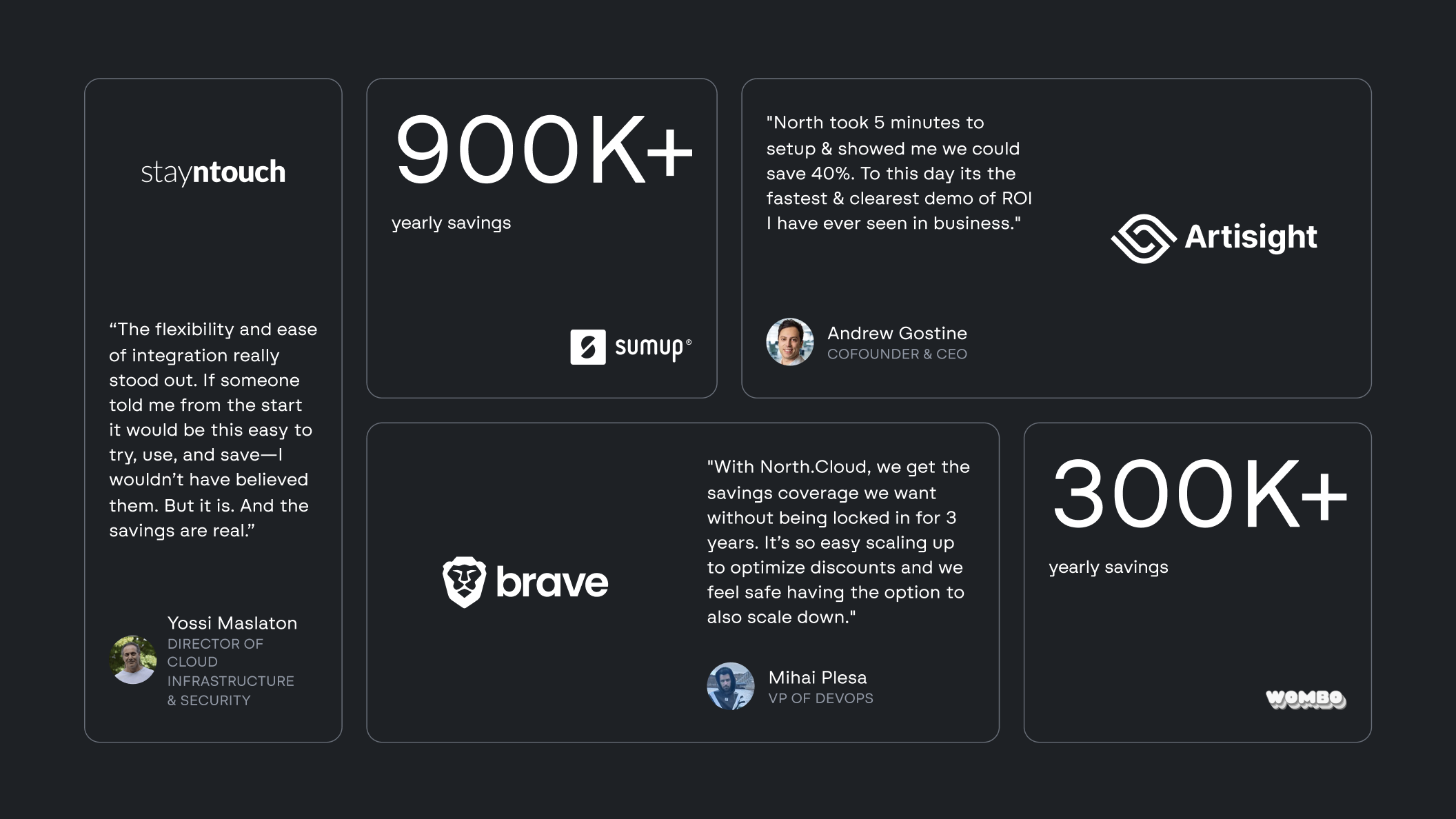
North ha completado su Series A con una inversión de 5 millones de dólares liderada por Companyon Ventures. Además, la compañía ha anunciado un acuerdo de patrocinio por el cual la plataforma FinOps se convierte en el Principal Training Kit Partner del Bristol City Football Club. El logotipo está presente en las camisetas de entrenamiento, sudaderas, abrigos y petos de entrenamiento. Por último, estamos orgullosos de haber recibido una Mención de Honor en Awwwards por el diseño de la web de North.
"Superaron nuestras expectativas."
No solo la calidad del trabajo fue mejor de lo que pensábamos, sino que diría que la calidad de su trabajo impactó nuestro negocio.
Proyectos relacionados